Visual language: the driving force of packaging development
- Like
- Digg
- Del
- Tumblr
- VKontakte
- Buffer
- Love This
- Odnoklassniki
- Meneame
- Blogger
- Amazon
- Yahoo Mail
- Gmail
- AOL
- Newsvine
- HackerNews
- Evernote
- MySpace
- Mail.ru
- Viadeo
- Line
- Comments
- Yummly
- SMS
- Viber
- Telegram
- Subscribe
- Skype
- Facebook Messenger
- Kakao
- LiveJournal
- Yammer
- Edgar
- Fintel
- Mix
- Instapaper
- Copy Link
Posted: 11 August 2006 | Riikka Salokannel, Design Manager, Oy Sinebrychoff Ab, Carlsberg Breweries | No comments yet
The requirement of all packaging is to protect, help with delivery, and pass on information about the product. This task must be achieved with the least amount of effort and as effectively as possible. There are millions of variations of making this possible and this article outlines some recent trends in packaging design.
The most interesting aspect – given the intense competition in the market today – is how to accomplish this whilst also making it ‘magnetic’ to consumers. In other words, what makes people want to pick up and examine the product? What specifically draws one’s eye? And when the product is in our hands, what makes us read on?
The requirement of all packaging is to protect, help with delivery, and pass on information about the product. This task must be achieved with the least amount of effort and as effectively as possible. There are millions of variations of making this possible and this article outlines some recent trends in packaging design. The most interesting aspect – given the intense competition in the market today – is how to accomplish this whilst also making it ‘magnetic’ to consumers. In other words, what makes people want to pick up and examine the product? What specifically draws one’s eye? And when the product is in our hands, what makes us read on?
The requirement of all packaging is to protect, help with delivery, and pass on information about the product. This task must be achieved with the least amount of effort and as effectively as possible. There are millions of variations of making this possible and this article outlines some recent trends in packaging design.
The most interesting aspect – given the intense competition in the market today – is how to accomplish this whilst also making it ‘magnetic’ to consumers. In other words, what makes people want to pick up and examine the product? What specifically draws one’s eye? And when the product is in our hands, what makes us read on?
From the Japanese we have learned that a product is worthless without a package. The package shows the way we want the product to be treated, and it places it in a certain hierarchy level. We measure a product’s value from what we see and experience and this doesn’t take long – just a few seconds, maybe less.
The package is not a piece of art created by one individual, but a part of the product and product image. It is also a part of the production, the technologies, the logistics and various systems of legislations involved. Naturally, packaging has a role in company strategies, management systems and corporation identity and each of these have an important impact on each package. Of course, compromises must be made, but the successful company is the one that combines these tasks and demands to create the ideal package solution. Because of all these demands and guidelines, package development is quite a slow process and not merely a case of rushing to create mega trends. It seems that the visual images are following the trends that movies and fashion and various trend makers are creating. This doesn’t mean that there is not creativeness in package design and development – on the contrary, creativeness is needed and used when challenging existing systems by creating new packages for new products, distribution channels, needs and behaviors.
The ‘magnetism’ of a product is related to the product image, the habitués of the package and the personality of the brand. To create this visually, the following points should be considered:
- The values of the final consumer and visual language they use
- Competing environments in marketing channels
- Company policy
Furthermore, the following questions should be posed:
- What is the product like?
- What is the personality of it?
- What are the tastes, flavours, qualities and prices?
Light beer packages should look like light beer. If the habitués is too heavy or too dark, it suggests a dark, full-flavoured beer which promises one thing and yet delivers another. In this instance the package has created a disappointment and no producer wants to create an association of disappointment with his product.
Visual trends
Visual trends are part of the visual language. We all have a visual ‘mother tongue’, along with a verbal ‘mother tongue’. Languages do not change that quickly. It is based on earlier experiences that we have learned and felt. We may have an association with a visual stimulus in a way that activates our actions automatically, without thinking. Certain colours can be associated with certain chocolates and that colour may guide our craving for chocolate and affect our actions. The ideal is to create packaging for a beverage product that makes your mouth water – it should be very hard to resist the feeling of thirst.
The reputable brands (the brands with very high good-will value) that draw consumers to them have their own strong visual elements, or stimulants, to which users can become addicted. The package becomes like Pavlov’s whistle. Once you have the right melody, and it works the way you would like it to, you shouldn’t change it radically. These visual ‘whistles’ that mega brands and other reputable brands have are qualities that competing producers may try to challenge by using similar elements. This phenomenon creates the group visual language for the product and sets guidelines for future package design. Beer has to look like beer and drinks should look refreshing. Visual trends around us change in waves, much faster than product association and language.
In package development and design trends must be followed because they are part of the consumers’ values. The value can be permanent, but its manifestation is changing all the time. Products must change in order to survive in the product evolution. By following the trends and understanding the visual language of package, development and design, one can face the increasing competition and new circumstances. The understanding of semiotics is crucial in all new situations.
Cultural divide
Visual language is different in different cultures and behaviors associated with certain products are different in different cultures. The traditional method of packaging products also differs depending on the culture. For example, here in Finland we put 82% of beverage packages in bottles, most of which are refillable bottles of the same shape as competitors’. Usage of cans is a growing industry, but it only comprised 18% of the market in 2006. Our neighbours, in Sweden, have the total opposite figures: They have a 95% usage of cans and only a 5% usage of bottles. Similarly, Germany is different to the UK; Switzerland has a usage percentage for all kinds of packaging types; while in Denmark glass bottles are dominating. (Source AC Nielsen). The basic elements for beverage packages, however, are the same. There is always a 3D shape, colours, written text, pictures or figures and a rhythm that brings each of these elements together. The semiotics (study of signs) of these can be evaluated individually or as a whole package. Past and existing trends can be evaluated and future trends can be predicted with research, sensitive visions and trusting instincts.
PET
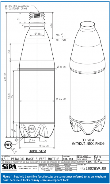
New technologies and methods are constantly changing things. One such example in the beverage industry has been PET. Technologically, the development is now concentrating on adding productivity to materials as PET itself is not too good at protecting sensitive beverage products, especially compared to glass bottles and cans, which provide a very long shelf-life for beverage products. PET is different in that 3D shapes are relatively easy and cheap to produce. For this reason, there have been all kinds of bottles on the market; some with very good design and shape, but most have been just a little different, cheap, or just ugly. However, when PET technology is used on mass-market products it means that volumes have been big enough for the packaging to be understood as a language code. Unfortunately for the PET world, such petaloid ‘elephant bases’ (Figure 1) with visually unattractive bottle shapes affect the visual synonym of PET images, and is lower down the packaging hierarchy. But this is not necessarily a bad thing. It seems that packaging development can proceed in two ways. Producers can continue with the attitude that the appearance of packaging is unimportant, which passes on the message of ‘cheapness’ to the consumer. This can certainly have a positive impact, as ‘cheapness’ is one of the main activators of certain purchasing choices. The other option is to design these shapes in a way that is integral to the brand’s personality; one that uses the most refreshing tactics and mouthing-watering lures.
Future possibilities
In general, all plastics are easy to mold, so it is possible to create new shapes and functions that serve more effectively for different purposes. Products are becoming increasingly fast and easy to open and use. In the future we will see safety solutions which indicate everything that has happened to the product from producer to consumer. The package will be a certificate of quality and we will also see joyous and funny packages. If the product can make the consumer smile, you have an advantage over the competition.
New materials will be used too – in the near future bio-based plastics will package brewed mass-market products (watch this space).
A view from the brewing industry
The glass industry has a conservative nature. However, despite this, there have been many technological innovations. There are finally certain beers available in flint bottles and clear bottles can now provide sufficient UV-light protection for sensitive beers and other fermented beverages.
The colour codes will change as a result of these innovations. For example, brown and green bottles have traditionally been used as the only real symbols of beer, but in coming years we will to see a rainbow of different-coloured bottles.
Production technology has also become more and more effective, although the consumer is the main player in the brand and product survival race, and he may be unaware of these changes. Despite the many cost savings and logistical developments the nature of the glass bottle has not changed. It gives a real, premium feeling as it is heavy (maybe too much so for one drink).
It is not part of our everyday behaviour to go to a restaurant; have a nice glass of wine; break the glass and melt it again to produce a new, but different glass or other waste glass base product. This is, however, the reality for the brewing industry. In the refillable glass bottle industry there is an understandable need for heaviness, but in the one-use world, there will be some challenge for the glass package. The volume of waste production is affecting our behaviors and continuing to be a factor, even though we try to ignore it.
All printed elements in packaging can follow the latest trends relatively quickly. Even those with limiting forces can do so. The Pavlov whistle is preventing the most extreme ideas filtering through, however. Coca-cola, for example, probably won’t change the red packaging colour very easily, and if a company adds colours to water bottles, it will be perceived that new ingredients and flavours have been added too. Colours will immediately be tasted strongly and other printed elements will have the same effect. Not only iconic pictures of fruits but, for example, shapes or fonts that are used on labels can create the perception of flavours or freshness. With colours, shapes and rhythm packaging can express abstract concepts.
Paper and printing technology is improving too. There are already labeled materials that can keep drinks colder for longer; protecting them from effects of warm hands. The evaluation of these products will decide which of these characteristics are important and which will disappear and leave space for other innovative ideas. Factors such as how long we keep a cold drink in our hand; whether the weather is warm or the hand is warm, all make it difficult to challenge the thirst.
Materials with staying power
Aluminium cans have been used for a considerable time and are definitely here to stay. Aluminum bottles, additionally, will grow in popularity – not only because they are easy, effective and light, but they are more or less the same for all brands. Aluminium is a material that will always have heavy commercial value. In the case of PET, however, there will always be a limit on effective bottle-to-bottle systems and on the need for fleece pullovers. We will see continued development for new kinds of aluminum-based packages. The development may not come from inside the packaging industry, but from outside innovative technology producers, such as the car-industry, or from those who are concentrating on human behaviors and needs.
The ‘homo shopper’
Modern lifestyles: human behaviour and ways of socialising; the way we search for food and refreshment in various retail stores etc. are all significant forces on future development. Each product and brand demands the attention of ‘homo shoppers’ – the ‘men who buy’. If these buyers have environmentally friendly values, then the packaging materials will be recyclable; if they prefer ‘risk-free’ packaging, then it will be secure; whereas, if they are looking purely for pleasure and ease-of-use, they will be satisfied with new packaging innovation that meets those needs.
The ‘homo shopper’ will be guided through the shops in a way that ensures that products covered with packaging materials, are jumping into the shopping trolley with little effort. By knowing the visual grammar, novelty and factors that can grab their attention and maintain it, the story of the brand is told. The ‘homo shopper’ wants the product to tell others who he is, through a technique which magnetically draws him to it. A major trend in the coming years is that there will be a jungle of products; a highly competitive struggle for supremacy, and that will create specialisation. The one who survives in this evolution is the one who can best understand consumer values, then dramatically differentiate and produce a product with characteristics that help it survive, rather than just by following passing trends.


Issue
Related topics
Packaging & Labelling, Quality analysis & quality control (QA/QC)


