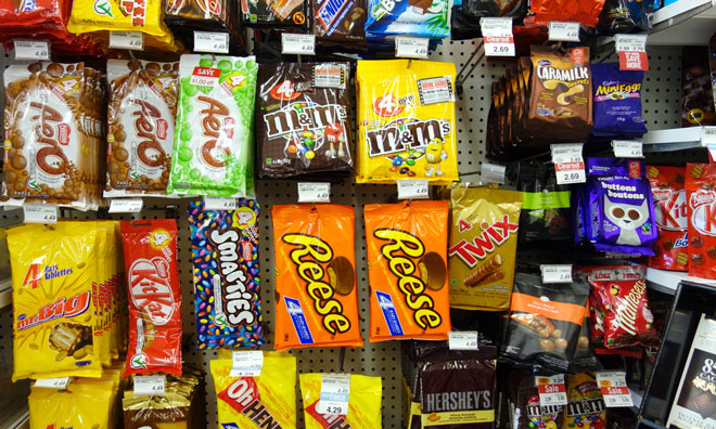
Do we really judge our food on the shade of its packaging?
- Like
- Digg
- Del
- Tumblr
- VKontakte
- Buffer
- Love This
- Odnoklassniki
- Meneame
- Blogger
- Amazon
- Yahoo Mail
- Gmail
- AOL
- Newsvine
- HackerNews
- Evernote
- MySpace
- Mail.ru
- Viadeo
- Line
- Comments
- Yummly
- SMS
- Viber
- Telegram
- Subscribe
- Skype
- Facebook Messenger
- Kakao
- LiveJournal
- Yammer
- Edgar
- Fintel
- Mix
- Instapaper
- Copy Link
Posted: 14 November 2016 | New Food | No comments yet
New Food decided to delve deeper and ask the researchers from Kiel University for a further insight into the idea that the colour of food packaging affects consumer choice…


In light of the news last week that the shade of packaging might affect our perception of the health and flavour of the contents of a product, New Food decided to delve deeper and ask the researchers from Kiel University for a further insight:


Could you briefly explain for our readership the findings of the research conducted by Kiel University and how you reached your conclusion?
Our research was looking at the implications of light-coloured (or pale) packaging for the consumer’s product perception and purchase decision. While conventional wisdom suggests that products with such packaging may be perceived “lighter” and thus healthier, we expected that pale packaging can be a double-edged sword inducing two effects that work in opposite directions. While improving health perceptions, we demonstrate that pale packaging also sparks doubts about product tastiness. The latter must be attributed to deeply rooted colour-related associations that pop up unconsciously as darker and richer colours tend to signal optimal development, ripeness, and quality for certain foods (esp. fruits and vegetables).
A second major goal was to answer the seemingly simple question of when light-coloured packaging helps or hurts. We find that this depends on whether consumers are looking at the product (such as in grocery stores) or actually tasted the product (e.g., at home). Unfavourable colour-induced taste inference are more powerful for consumer decision-making when visual perception is available only. To infer product tastiness (which is the most important criterion for most consumers), they have to rely on heuristic package cues. However, when consumers are able to actually taste the product, such inferences are not necessary as oral sensory information is available. Healthiness, on the other hand, is very difficult to detect for consumers, even when tasting. For this reason, package colour-induced health inferences occur even after tasting the product.
“Unfavourable colour-induced taste inference are more powerful for consumer decision-making when visual perception is available only…”
We further show that the consumer’s judgement goal is a second crucial aspect that needs to be considered when determining optimal package colour. The positive health effect of pale packages occurs primarily for health-concerned consumers. However, negative taste associations are more likely activated by less health-conscious consumers. In brief, light-coloured packaging has different meanings to different shoppers in different food retail environments. Food companies should not forget about these mechanisms in order to avoid sub-optimal packaging. The opposing colour-induced effects were tested across a series of six experiments which used highly diverse methods (e.g., reaction time measurement, choice experiments) and designs manipulating and testing actual food products.
Why in particular did you begin researching this topic in particular?
Needless to say that health-concerned consumers have become a sought-after market segment. Across the world, food companies are offering a number of healthy options (e.g., diet products, reduced-fat/sugar), which are often put in light-coloured packaging to signal healthiness (or to create the impression of healthfulness). Intuitively, this seems a reasonable strategy because food shoppers might associate light-coloured packaging with product healthiness (e.g., the product is less nourishing, energy-poor, etc.). What has been largely overlooked is that this supposedly positive package health cue may spark doubts about other valued characteristics of the food product. While aiming at health perceptions, light-coloured packages may trigger less favourable taste associations in the consumer’s mind (e.g., less intense taste or flavor) that have the potential to undermine packaging effectiveness (and thus sales). This challenges conventional wisdom and served as a starting point for our research.
What implications do the findings have for the food and beverage industry, in your opinion?
Food providers have to be careful when attempting to signal product healthiness with the help of pale packages because – as outlined in question 1 – this package cue has different meanings to different shoppers in different food retail environments. On the one hand, light tones can be harmful when consumers build first impressions by briefly looking at the food product or beverage (e.g., at the shelf in the grocery store) or when targeting less health-aware consumers (or when the product is typically bought for indulgence instead of achieving/maintaining good health). In these situations, light-coloured packaging is likely regarded as a signal to a taste decrease. Food companies are advised to differentiate the packaging or they may evade unfavourable taste inferences using darker shades by simultaneously abandoning the benefit of signalling health.
Positive health impressions are more likely to boost purchase intentions…
Positive health impressions are more likely to boost purchase intentions when consumers are not led to make heuristic assumptions. When marketers make tasting possible by product sampling or front cooking, the negative taste effect could be reduced. Overall, our research stresses that references to health benefits should be applied with great caution when addressing target segments for which health is not the overarching priority because these consumers are susceptible to associating a package health cue with a lack of taste, especially if this attribute is hidden (such as in an in-store-situation). Employing darker tones for healthier options could be a way—among others—to compensate for a perceived taste decrease.
Will Kiel be continuing its research on the topic?
Yes, we continue research on food packaging and subtle marketing cues that help to increase the attractiveness of healthier product variants and to overcome obstacles. In particular, in our research we aim at finding new ways to overcome a (perceived) taste stigma of healthier foods rather than giving consumers advice for “good” eating behaviours which often results in a reaction.
You can read more on the research from Kiel University here…


